Simple Seamless Machine Data
We’ve all heard of the connected farm and the promise of data flowing from one device to the next with ease. But in the real world, the process of getting your data from the planter, sprayer or combine onto your computer is far from effortless and it almost always is a frustrating task. That’s where Agrian comes into play. With committed focus, Agrian’s Next Generation Machine Data Platform makes good on the promise of seamless connectivity, once and for all.
Elementary-School Simple
Agrian’s Machine Data platform lets growers and the advisors they trust upload raw planting, application and harvest data straight from the planter, combine or sprayer onto their computers, where it’s turned into easy-to-read, actionable insight they can access on their desktop, tablet, or smart phone. It also analyzes sensor-collected soil data from companies like Veris, Geonics, SoilOptix and more. It works like this:
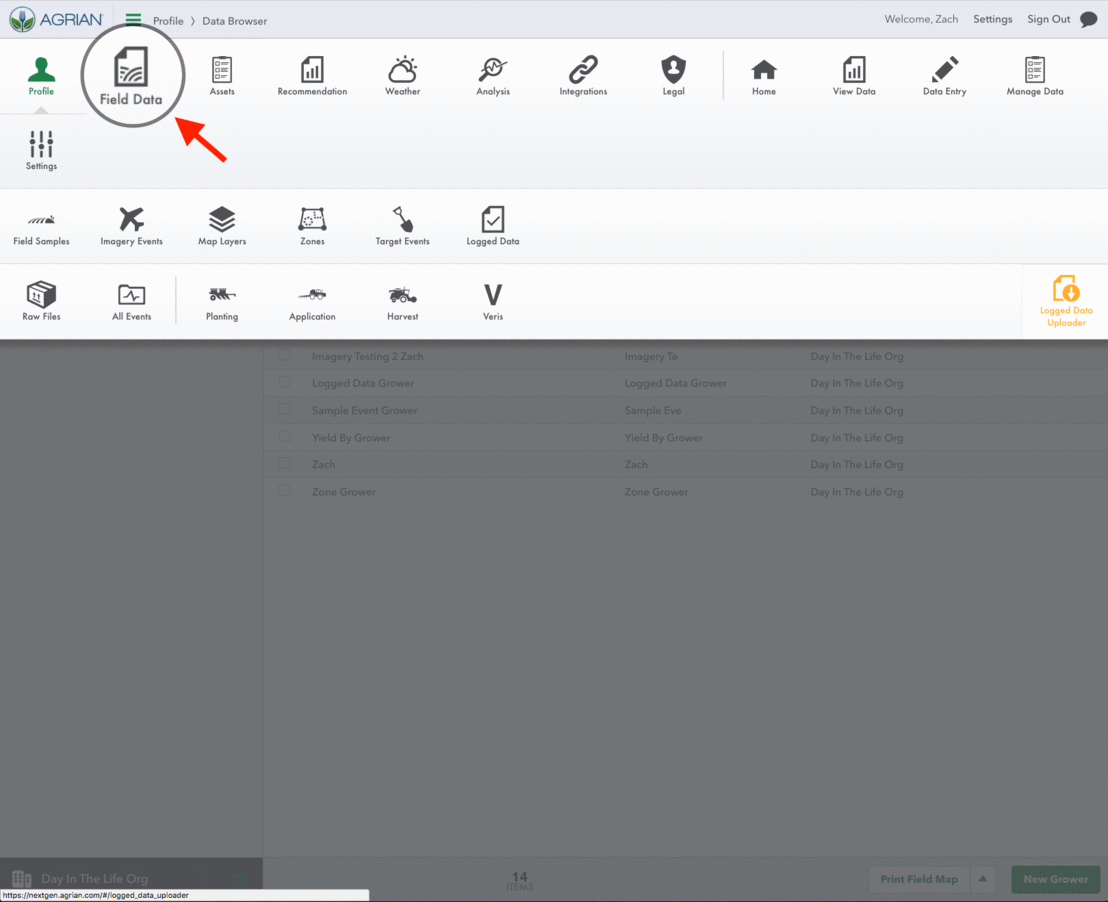
First, go to your Agrian dashboard and click on Field Data. Then, click on Logged Data in the subfield below it. Then, select Logged Data Uploader on the right-hand side of your screen.
After you drag and drop your raw file from your desktop into the box that appears, wait a few minutes for it upload. Once done, you’re ready to go.
Agrian categorizes data in three ways: by Planting, Application, and Harvest events, in addition to soil-sensor data. All of this data is sorted by commodity and field—but don’t worry if over the seasons various operators have called the same fields by different names. The system will point the data to the right place by GPS, rather than file name.
Clicking Through Map Layering
Click on the Map Layering tab under Logged Data, and gain access to the lens through which you’ll watch your data come to life. Click on the specific field, type and date you want to see and you’ll paint the pictures you’re looking for. It’s Agrian’s GIS (Geographic Information System) and analysis tool, the way your data is transformed into pictures you can tell a story on your grower’s field.
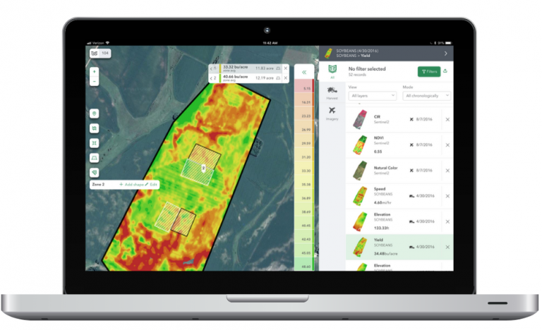
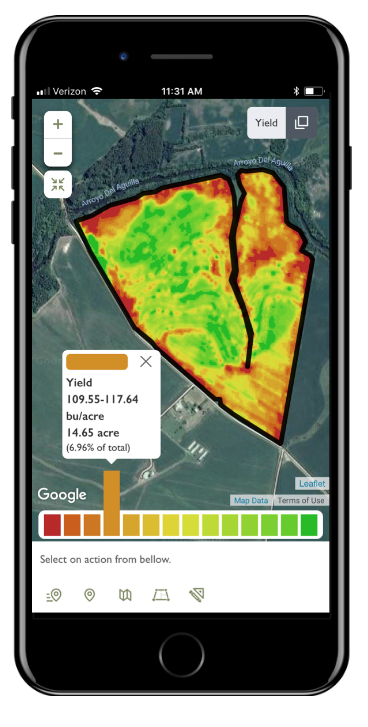
Take Yield data, for example. You can filter by field, Layer type, and date, and watch the map come to life. Red represents lower values; green higher. The below map is how it would appear on a user’s smart phone.
You can even zero-in on specific areas of any given field with the Zonal Stats feature. Simply outline the individual areas you want to learn more about and watch their zonal stats appear in real time.
“This is how users can isolate specific areas of any field and identify what’s going on,” said Peter Brandt, Chief Technology Officer at Agrian “This kind of technology allows you to break up your data on the sub-field level to get the most out of every acre.”